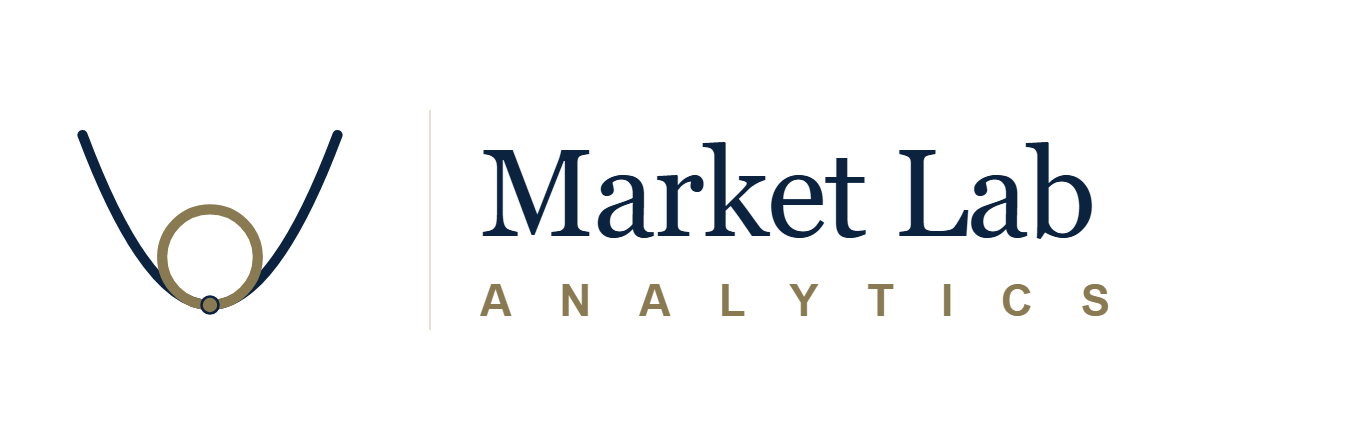
A line and a circle, meeting at exactly one point.
That single point is a 350-year-old idea from calculus — the one circle that bends exactly the way a curve bends at one moment in time. It is also how we read markets.
The osculating circle
When a curve bends, you can always draw the one circle that bends with it the exact same way at a given point. Mathematicians call it the osculating circle, from the Latin osculare — “to kiss.” It meets the curve at a single point and, right at that point, carries the same curvature. Not more. Not less.
Two curves, two osculating circles. A flat market calls for a large, loose circle. A sharp bend calls for a small, tight one.
Three truths in one picture
- The curve is the market — complicated, moving, not reducible to a straight line.
- The circle is our best local model: the simplest shape that honestly matches what the market is doing right here, right now.
- The kiss is the measurement. One exact point of contact — an alert, a call to action. No illusion. No overreach. No promise to describe the whole curve from a single reading.
Every analytics firm claims to see the whole market. We are interested in the one circle that fits the inch of curve we are standing on.
What this means for the work
Everything Market Lab Analytics publishes is one of these circles. A signal is a circle. A playbook is a wider circle. A portfolio is a sequence of them. Here is what that means in practice.
A signal is a circle
Each of our signals is one circle — a precise local reading of one market at one moment. A grain-stocks tightening. A Treasury carry window opening. A sector-rotation band breaking. The circle does not try to be the whole curve. It says, right here, right now, this is what the market is doing, and this is how I would describe the next inch of road.
A playbook is a circle too
Our playbooks combine several signals into a single local model, but the geometry is the same. A playbook is a circle fit to a wider stretch of the curve than any single signal could cover. More inputs, more context, a longer section of market behavior described faithfully. Still one point of contact. Still no claim to describe the whole curve.
A portfolio is a sequence of circles
Our allocations trace the market by stepping along it, re-fitting at each new moment. Yesterday’s reading is retired. Today’s circle kisses today’s curve. Tomorrow’s will do the same. A Market Lab Analytics portfolio is not a prediction of where the market goes next; it is a disciplined record of how we are locally describing it as it moves.
Why the kiss matters
At the point where the circle meets the curve, the two touch at exactly one place. Not approximately. Not with a shrug. Exactly one place.
That is the standard for every reading we publish. If we cannot describe a reading that precisely, we do not ship it. The kiss is both the logo’s quietest detail and the loudest promise we make.
Logos you see every day — and what you probably never noticed
Our logo is in good company. Here are twenty-three others doing quiet work beneath the surface — each one legible once you know where to look, invisible until then.
Hidden letters
FedEx — a purple and orange wordmark. (1994)
What is actually there: In the negative space between the capital E and the lowercase x, a right-pointing arrow — the symbol of forward motion and delivery.
Why: Designer Lindon Leader, working at Landor Associates in 1994, custom-drew a hybrid of Univers and Futura just to make the two letters’ white space form that arrow at the exact angle he wanted. He raised the crossbar of the lowercase x by a few points, which turned the gap between E and x into a perfect arrowhead with a notched tail. The letters were engineered around the arrow, not the other way around.
The gift that keeps giving: Most people never see the arrow — until someone points it out, and then they can never un-see it. The mark has won over forty international design awards and is routinely named one of the best logos of the twentieth century. Leader was asked once if he regretted not charging extra for hiding the arrow. He said no — the hidden mark was the gift, and the gift was the point.
Amazon — a yellow curved arrow that looks like a smile. (2000)
What is actually there: A yellow arrow curving from the a to the z. It is not a smile — it is a sentence. “Amazon sells everything, from A to Z.” The smile is the bonus.
Why: Agency Turner Duckworth went through five rounds of revisions before Jeff Bezos signed off in 2000, replacing an earlier Amazon logo that had a swooping river reference (as in the actual Amazon). Bezos reportedly wanted the mark to say “we have everything” without using the words. Turner Duckworth’s answer was a single curved line that both reads as a reach from the first letter to the last and smiles at you while it does it.
The dimple detail: Look closely at the left end of the arrow — it has a slight tilt upward that lands exactly under the a, and the right end tapers into a point that sits precisely beneath the z. The curve is not a generic smile; it is a precisely drawn reach from one end of the alphabet to the other. Entire design-studio seminars have been built around the economy of that one curve doing two jobs with no visible effort.
Toyota — three overlapping ellipses inside a larger oval. (1989)
What design folklore holds: All six letters of T-O-Y-O-T-A, said to be hidden inside the three ellipses. The inner vertical ellipse is a T. The small horizontal ellipse that crosses it closes into an O. The outer oval is another O. The remaining negative space traces the Y, the second T, and the A.
Why: Introduced for Toyota’s fiftieth anniversary in 1989 as part of a corporate-wide identity refresh. Officially described as representing three ideas: the heart of the customer, the heart of the product, and the limitless potential of the future. The hidden alphabet was the quiet signature underneath — proof you can compress a six-letter wordmark into a shape small enough to stamp on a bumper.
The engineering constraint: Toyota’s industrial designers were in the room with the brand team during the final design rounds, because the logo had to reproduce consistently when cast in metal and chrome-plated for car badges. Any curve too tight or line too thin would collapse at manufacturing scale. The final design is a graphic solution to a factory problem — six letters, three shapes, one promise, all survivable on a die press.
Milwaukee Brewers — a baseball nestled inside a fielder’s glove. (1978)
What is actually there: The fingers of the glove form a lowercase m. The thumb curving around the ball forms a lowercase b. The whole image is the team’s initials, hiding in a glove.
Why: In 1977 the Brewers held an open design contest for a new logo. Tom Meindel, a twenty-five-year-old art student at the University of Wisconsin–Eau Claire, sketched the m-b-in-a-glove by hand (no computer — this was 1977) and mailed it in. He won two thousand dollars. The logo debuted on uniforms in 1978 and became one of the most beloved marks in Major League Baseball.
The second life: The Brewers retired the glove in 1994 for a more generic script wordmark, and fans never stopped asking for it back. The team wore it on retro-Thursday jerseys for years before officially restoring it as the primary identity in 2020. Meindel, who had spent his career as a graphic designer and later a professor, was flown to Milwaukee to throw out the ceremonial first pitch of the restored-logo season. The crowd — many of whom had grown up with his glove on their fathers’ caps — gave him a standing ovation.
Baskin-Robbins — a pink-and-blue BR monogram. (2005)
What is actually there: The pink parts of the B and the R form the number 31 — the chain’s original “31 flavors, one for every day of the month” promise.
Why: In 1945 Irv Robbins and Burt Baskin opened an ice-cream parlor in Glendale, California, with a promise that a customer could try a different flavor every day of a thirty-one-day month without repeating. The number became load-bearing to the brand — menus, cups, signage, uniforms. When the identity modernized in 2005, designers Carbone Smolan refused to let the 31 disappear. They tucked it into the pink segments of the B and R, invisible until pointed out.
The second discovery: Most Baskin-Robbins fans only noticed the 31 after a 2010s video pointed it out online. The clip went viral; the brand’s social team responded with its own video confirming it, and the mark gained a second life as “the logo you learn to see.” The chain has long since expanded past a thousand flavors invented across its history, but the number tucked inside the letters is older than the parent company that owns the brand today.
Formula 1 — a red-and-black speed mark. (1994–2017)
What is actually there: In the negative space between the black capital F and the red speed-lines on the right, a hidden 1. One letter and one number compressed into a single shape.
Why: Designed by Carter Wong Tomlin in 1994 for the Formula One Administration, the mark packed two signals into one gesture: the F identifying the series and the 1 signalling the top class. The angles of the red streaks and the width of the gap between them were tuned specifically to make the hidden 1 unambiguous. The racing world — famously detail-obsessed — generally missed it for years.
The retirement: In 2018 Formula 1 replaced the mark with a smoother, more digital-ready red swoosh. Designers and fans protested loudly; many argued the 1994 mark was one of the finest hidden-letter logos ever made and should not have been retired for a brand refresh. The old mark now lives on in motorsport nostalgia, retro license plates, and vintage merchandise. The replacement, nearly a decade in, has never acquired the same affection.
Vaio — four letters in a wave-and-digit wordmark. (1997)
What is actually there: Four letters doing double duty. “VA” is drawn as an analog sine wave. “IO” is drawn as a binary 1 and 0. Analog meets digital, in four letters.
Why: Vaio was launched by Sony in 1996 as a computer brand aimed at bridging audio-video entertainment (Sony’s heritage) and personal computing (then still arriving in homes). The name was originally an acronym — Video Audio Integrated Operation, later Visual Audio Intelligent Organizer — and the logo turned the acronym into a visual poem about convergence. Designer Timothy Hanley sketched the mark in a single afternoon after Sony’s brand team briefed him on the “analog-to-digital bridge” concept.
Why it still matters: Convergence is now assumed; in 1997 it was the whole industry argument. The Vaio logo was one of the first to communicate “these two worlds are the same device now” without saying it in words. Sony sold the Vaio PC business in 2014 but the brand (and the logo) continued in Japan. Designers still cite the mark as a near-perfect compression of a long thesis into four characters.
Hershey’s Kisses — a silver-and-brown wordmark. (1962)
What design folklore claims: Between the K and the I in the word “KISSES” on every wrapper, a tiny sideways chocolate kiss is said to sit in the kerning gap — the product shape, hiding inside the product name. Hershey’s has denied any intent to hide a mark there. The rumor has not slowed down.
Why: Hershey’s Kisses launched in 1907, individually hand-wrapped in silver foil. The paper plume (the “flag”) was added in 1921 to help assembly-line workers verify the chocolate was intact inside its wrapper. The wordmark on the modern wrapper was redesigned in 1962, and the typographer tucked a tiny silhouette of the chocolate between the K and the first I — the only place in the wordmark where the spacing allowed it.
Why most people miss it: The silhouette is intentionally the same color as the surrounding type, no accent, no highlight. It reads as a letter-spacing artifact until you know what to look for. Hershey’s has rarely drawn attention to it. Social media threads periodically re-discover it. Each round of discovery adds another decade of fans to the “oh I never noticed” club.
Hidden figures & history
Toblerone — the Matterhorn, the Swiss peak on every bar. (1908)
What is actually there: A rearing bear carved into the shadow on the right side of the Matterhorn, visible only once you know where to look.
Why: Toblerone was invented in Bern, Switzerland, in 1908 by chocolatier Theodor Tobler (the name is a portmanteau of “Tobler” and torrone, the Italian word for nougat). Bern is nicknamed Bärenstadt, the City of Bears — a bear is on the city’s heraldic flag, there is a bear enclosure by the Aare river, and the animal has been Bern’s civic emblem for centuries. Tobler hid his hometown inside his mountain, and the bear has lived in the shadow of the Matterhorn ever since.
The 2016 incident: When Toblerone’s owner widened the gaps between triangles to shrink the bar without changing the price, consumers in Britain and Switzerland noticed within days. The outcry was loud enough to reach the financial press. Within two years the geometry was quietly restored to its original spacing. The bear, as always, said nothing.
Hyundai — a slanted silver H inside an oval. (1990)
What is actually there: Two people shaking hands — a company representative on the left, a satisfied customer on the right. The two legs of the H are their torsos; the slanted crossbar is the handshake itself.
Why: The whole mark is a brand promise rendered in one letter. The slant signals forward motion. The oval represents the company’s global reach. “Hyundai” in Korean (현대) means modernity. Introduced in 1990 as part of a corporate identity refresh, the mark was designed in-house to work equally well as a car badge, a signage element, and a glyph in body text.
The quiet detail: The handshake tilts slightly downward from the representative to the customer — a visual cue that in Korean business culture signals respect and deference to the customer side of the exchange. A logo doing double duty as a cultural courtesy, legible to anyone who knows the convention and invisible to anyone who does not.
Mercedes-Benz — a three-pointed star inside a circle. (1909)
What is actually there: Three domains of dominance — land, water, and air. One point for each environment Daimler engines were built to power.
Why: In 1872 Gottlieb Daimler drew a three-pointed star on a postcard to his wife Emma, over a sketch of the family’s new house in Deutz, writing on the back that one day “this star will shine over my factory and bring prosperity.” Daimler died in 1900 without ever having turned the sketch into a trademark. In 1909 his sons Paul and Adolf, now running the company, proposed the three-pointed star as the official mark. It was registered later that year.
The merger that almost erased it: In 1926, Daimler-Motoren-Gesellschaft merged with Benz & Cie., which had its own emblem — a laurel wreath. The combined firm (Daimler-Benz AG) spent nearly a decade displaying a three-pointed star nested inside a laurel wreath, a diplomatic compromise mark. In 1933 the wreath was dropped and the star inside its plain circle has barely changed since. Emma Daimler never saw the star on a car; she died in 1889, well before the family business made its first automobile.
Audi — four silver interlocking rings. (1932)
What is actually there: Each ring is one of the four German carmakers that merged in 1932 to form Auto Union: Audi, DKW, Horch, and Wanderer.
Why: The merger was forced by the Great Depression. Four struggling German automakers consolidated to survive, and August Horch himself — founder of both Horch and Audi — designed the four interlocking rings to represent the union. The order of the rings on the badge reflects the order the four firms stood in the 1932 alignment, a frozen piece of corporate history still rolling down highways nine decades later.
The naming trivia: “Audi” is a Latin translation of “Horch.” In German, horch is the imperative listen; in Latin, audi is the same word. August Horch founded his first company (Horch) in 1899, lost the right to use his own surname in a trademark dispute, and immediately translated it to the language his schoolteacher son happened to be studying. The joke was deliberate. Only one of the four 1932 firms survived in a form a modern driver would recognize — the one named after a Latin pun on its founder’s own name.
NBA — an anonymous player silhouette dribbling left. (1969)
What is actually there: A specific person. Not an anonymous player — Hall of Famer Jerry West, traced from a Wen Roberts photograph taken during a Lakers game in 1969.
Why: Designer Alan Siegel was commissioned by then-commissioner Walter Kennedy in 1969 to modernize the league’s identity. Siegel chose the Roberts photograph of West dribbling because, in his words, it captured “action, athleticism, and the body language of basketball” in a single silhouette. The commission paid roughly twenty-five thousand dollars — about two hundred thousand in today’s money.
The acknowledgement that never came: The NBA has never officially confirmed the silhouette is West. Siegel confirmed it decades ago, on the record, repeatedly. West confirmed it too, and said more than once that he found it uncomfortable: he wanted the league to update the mark to a more modern player, or to make it genuinely anonymous. The NBA has declined every suggestion. The logo is simultaneously the most-licensed sports graphic on earth and a tribute to a specific man the organization refuses to name.
Unilever — a large blue cursive U made of little shapes. (2004)
What is actually there: Twenty-five tiny icons, each one standing for something Unilever makes or stands for — compressed into the single blue letter U.
Why: Designed by Lee Coomber at Wolff Olins (London) in 2004 after an eighteen-month process. Unilever owns four hundred-plus brands across every grocery aisle — Dove, Lipton, Hellmann’s, Ben & Jerry’s, Axe, Vaseline, Knorr, Magnum. The previous corporate mark was a plain block-letter U that said nothing about any of them. Wolff Olins proposed the opposite: cram the whole company into one letter and let the reader discover it piece by piece.
The twenty-five, in order around the U: an ice-cream cone, a strand of hair, a pair of lips, a flower, a bowl of food, a bird, the sun, a DNA helix, a hand, a heart, a leaf, a fish, a chili, a snowflake, a tea leaf, a drop of liquid, a sparkle, a palm tree, a flame, a swirl, a spoon, a shirt, a package, a wave, and a particle. Each one earned its place after being argued over, redrawn, and tested against the others for visual rhythm. One letter, twenty-five product categories — one of the few corporate logos that keeps rewarding closer inspection.
Nike — a single curved stroke. (1971)
What is actually there: The curve of a wing. Specifically, the wing of the Greek goddess Nike — the personification of victory — abstracted into one continuous stroke.
Why: In 1971 Phil Knight, then launching the shoe brand that would become Nike, hired a Portland State University graphic design student named Carolyn Davidson to design a mark for the first running shoe. Davidson billed him thirty-five dollars. Knight reportedly looked at the swoosh and said, “I don’t love it, but it will grow on me.” It did.
The second payment: Thirteen years later, in 1983, with Nike a public company, Knight invited Davidson to a company gathering and surprised her with a diamond-and-gold Nike ring and an envelope of Nike stock worth — at the time — a small fortune. Davidson still has both. In interviews she has said she was paid fairly for 1971’s work; the stock was a thank-you, not back pay. The swoosh is now one of the most-reproduced marks in human history. It started as a weekend assignment for a college student who needed the thirty-five dollars.
Starbucks — a green ring with a crowned figure inside. (1971)
What is actually there: A twin-tailed siren — the sea creature of Greek mythology who lured sailors onto the rocks with her song. Starbucks adopted her as a nod to Seattle’s maritime history and to the pull of the first cup of the morning.
Why: In 1971, when Starbucks was a single store near Pike Place Market in Seattle, the founders commissioned a logo based on a 16th-century Norse woodcut they had seen in an old nautical book. The original siren was topless, held both tails above her head, and looked more mythological than welcoming.
The progressive zoom-in: Over four redesigns (1971 → 1987 → 1992 → 2011), the siren has been progressively zoomed in and cleaned up. By 1987 her chest was covered by her hair. By 2011 the frame had cropped out her lower torso and tails entirely, leaving a face, a crown, and two curving edges where tails used to be. Most people under forty have never seen her bottom half. The vintage woodcut version still exists on the oldest Pike Place store’s awning as a historical reference — unretouched, two tails and all.
Apple — a silhouetted apple with one bite out. (1977)
What is actually there: An apple with a bite out of its right side. The bite is not a tribute to Alan Turing (common internet myth), not a reference to Isaac Newton (first-logo myth), and not a Biblical reference (brand-skeptic myth).
Why: Designer Rob Janoff was commissioned by Steve Jobs in 1977 to replace the original Apple logo (an elaborate Isaac-Newton-under-a-tree engraving that Jobs disliked). Janoff drew a simple silhouetted apple shape and asked himself what to do next. He added the bite for a single practical reason: without it, at small sizes the apple looked like a cherry or a tomato. The bite was for scale, nothing more. (It also, by happy accident, puns on “byte.”) Janoff charged roughly five hundred dollars for the design.
The rainbow and after: Janoff’s original was striped with six colors — Jobs wanted the Apple II’s full-color graphics advertised in the mark itself. The rainbow version was Apple’s identity until 1998, when Jobs returned to the company and immediately swapped it for a monochrome silhouette. Janoff has spent decades patiently correcting the Turing legend in interviews. His own version: “The Turing story is more romantic than the truth. The truth is I was drawing an apple, and it needed to look like an apple.”
Tostitos — a red wordmark with a yellow dish beneath. (2004)
What is actually there: Hidden in the center of the wordmark, two people sharing a chip over a bowl of salsa. The two Ts in TOSTITOS are the two people, facing each other, leaning in. The dot above the lowercase i between them is the salsa. The yellow circle underneath is the bowl.
Why: Designed by the Frito-Lay in-house brand team in 2004 as part of a packaging refresh. The brief: communicate “shared snacking” without using the words “shared snacking.” The team tried a dozen approaches — people-shaped bags, chip-shaped letters, hands reaching into bowls — before realizing the two Ts already looked like people if you leaned them in slightly and gave them a reason to meet in the middle.
Why it works: The hidden image rewards exactly the behavior the product is sold for. You see the bag at a Super Bowl party, you look twice, you point it out to the friend next to you, you both laugh. The logo doesn’t just describe shared snacking; it causes it. It is one of the few grocery marks that creates its own category of memorable packaging moment, roughly once per party.
London Underground — a red ring crossed by a blue bar. (1917)
What is actually there: A simple geometric mark — a red circle intersected by a horizontal blue bar — that has carried the London Underground brand, essentially unaltered, for over a century. Designed by calligrapher Edward Johnston in 1917 using his own geometric sans-serif typeface, Johnston Sans.
Why: In 1908 London Underground commissioned a solid red disc with a blue bar across it to make station names legible against the busy platform advertising of the time. By 1917 the disc had been hollowed into a ring, giving the mark its final geometry: pure circle, pure horizontal, pure color. Johnston’s typeface — the first major custom-drawn sans-serif of the twentieth century — predated Futura by ten years and set the template for modernist European signage everywhere.
Why it is still copied: The roundel is now one of the most-recognized transit marks on Earth. Dozens of cities (Moscow, Hong Kong, Buenos Aires, Lisbon) adopted variants of the circle-and-bar form for their own metros. Johnston Sans is still, with only cosmetic updates, the official typeface of Transport for London. The 1917 design has outlasted empires, world wars, and the entire history of brand consultancy. Not a single structural element has been removed or added to it in more than a century.
Hidden math
Olympic Rings — five interlocking rings. (1913)
What is actually there: The rings represent the five inhabited continents competing. The six colors — the five ring colors plus the white background — were chosen so that every national flag in the world at the time contained at least one of them.
Why: Pierre de Coubertin designed it in 1913 as a solvable constraint problem: find a palette of six colors that covers every flag on Earth. He succeeded. The logo is a global compatibility proof hiding in plain sight.
Why it has held: Dozens of countries have joined the Olympic movement since 1913 — many with new flags featuring new color palettes — and the five-ring, six-color mark still satisfies Coubertin’s original constraint. The design was mathematically robust enough to survive a century of decolonization, independence movements, and new national flags without ever needing a seventh color added.
Twitter “Larry” bird — a blue bird in flight. (2012–2023)
What is actually there: A simple blue bird — internally called “Larry,” after Larry Bird of the Boston Celtics (one of Twitter’s founders was a fan). Constructed from exactly fifteen overlapping circles in specific size ratios.
Why: In 2012 Twitter commissioned designer Martin Grasser to replace the previous bird (which had been a hastily-vectored stock illustration). Grasser’s answer was a bird whose every curve, feather, and tail-fork was traced from the arcs of fifteen overlapping circles in precise size ratios: the head is one circle, the body is one circle, the wing is three circles, the tail is three circles, and so on. The design team published the full geometric construction diagram, like a classical geometry proof. Students could reconstruct Larry from a compass and a size table.
Why it was retired: In 2023 Elon Musk replaced Larry with a stylized X letter mark, ending the bird’s decade-long run. Designers worldwide expressed open regret. The construction diagram, however, continues to be shared and reposted; design students study it as a modern master-class in geometric mark-making. The last version of Larry is one of the few corporate marks in history for which the mathematical blueprint is both public and beautiful.
Woolmark — an abstract swirl of interlocking strands. (1964)
What is actually there: A mathematically-constructed interlocking spiral that resembles tangled skeins of wool — the certification mark for all-wool products worldwide.
Why: In 1963 the International Wool Secretariat held an open design competition to create a certification mark that could appear on garments in every market. Over one hundred designers from around the world submitted. The winner, selected in 1964, was Italian designer Franco Grignani — but Grignani was also on the judging panel, and had submitted anonymously under a pseudonym to avoid influencing the vote. His entry was selected on its own merit; the double identity surfaced only after the result was announced. The Secretariat kept the result and the story became design folklore.
Why designers still cite it: Grignani’s mark is a shape you can draw with compass and straightedge — no decorative elements, no color, no type. It has survived six decades of brand refreshes untouched, appears on billions of garments, and is routinely cited in design-school curricula as one of the half-dozen greatest logos ever made. In 2007 the New York Times called it “almost impossible to improve on.”
MasterCard — two overlapping circles. (1968)
What is actually there: Two circles — one red, one yellow — overlapping by a precise mathematical ratio. The shared orange region is exactly one-third the diameter of each circle. Not eyeballed, not approximate; geometrically specified in the brand standards.
Why: The two-circle Interbank mark debuted in 1968 to signal that MasterCharge (as the company was first called) was a merger of several banking consortiums. The two circles represented the merging institutions; the orange overlap zone represented the combined network. The precise one-third overlap was fixed in brand standards for a specific reason: a smaller overlap read as two separate circles; a larger overlap read as a single circle. The one-third ratio was the only value that unambiguously said two circles meeting in common cause.
Why the ratio has held: The identity has been refreshed many times since (most recently by Pentagram in 2016, which dropped the wordmark entirely for most contexts), but the two circles and their one-third overlap have never been altered. It is one of the few corporate marks whose precise geometric specification has survived every brand-consultant era intact. The reason: once you change the overlap, the mark stops meaning “common ground.”
Note the family resemblance: the mark survives because its geometry is forced, not chosen. Osculating circles work the same way — there is exactly one circle that matches a curve at each point. Change it, and it stops fitting.
Pittsburgh Steelers — three colored diamonds inside a circle. (1962)
What is actually there: They are not diamonds. They are astroids — four-cusped hypocycloids, the curve traced by a point on a small circle rolling inside a larger one. Precise, mathematical shapes.
Why: The Steelmark was designed by U.S. Steel: yellow for coal (lightens work, brightens leisure), orange for iron ore (yields strength), blue for scrap steel (yields the metal). Pittsburgh borrowed it in 1962. The Steelers are the only NFL team whose logo appears on just one side of the helmet — because that was how they tested it the first season and the record was good, so it stayed.
Note the family resemblance: a small circle rolling along a larger one, tracing a curve. The osculating circle is a cousin — a small circle meeting a larger curve at exactly one point.
Now look at ours again
A line, a circle, and a kiss.
Nothing hidden. Nothing clever. Just the oldest and most honest way the math knows to say: here is the market, here is our best local reading of it, and here is the single point where the two meet.
That is where action lives.
MARKET LAB ANALYTICS